Problem & why it mattered
A critical back-office platform looked modern, but behaved
like a legacy terminal, slowing RMs and putting the design-system rollout at risk.
Context
- Product: A private banking portfolio
management platform used by Relationship Managers (RMs) to retrieve
portfolios, monitor performance, and run multi-step approval workflows.
- Why it mattered: This was a flagship
rollout to prove the new design system could scale across future
middle/back-office
products.
What was broken / risky
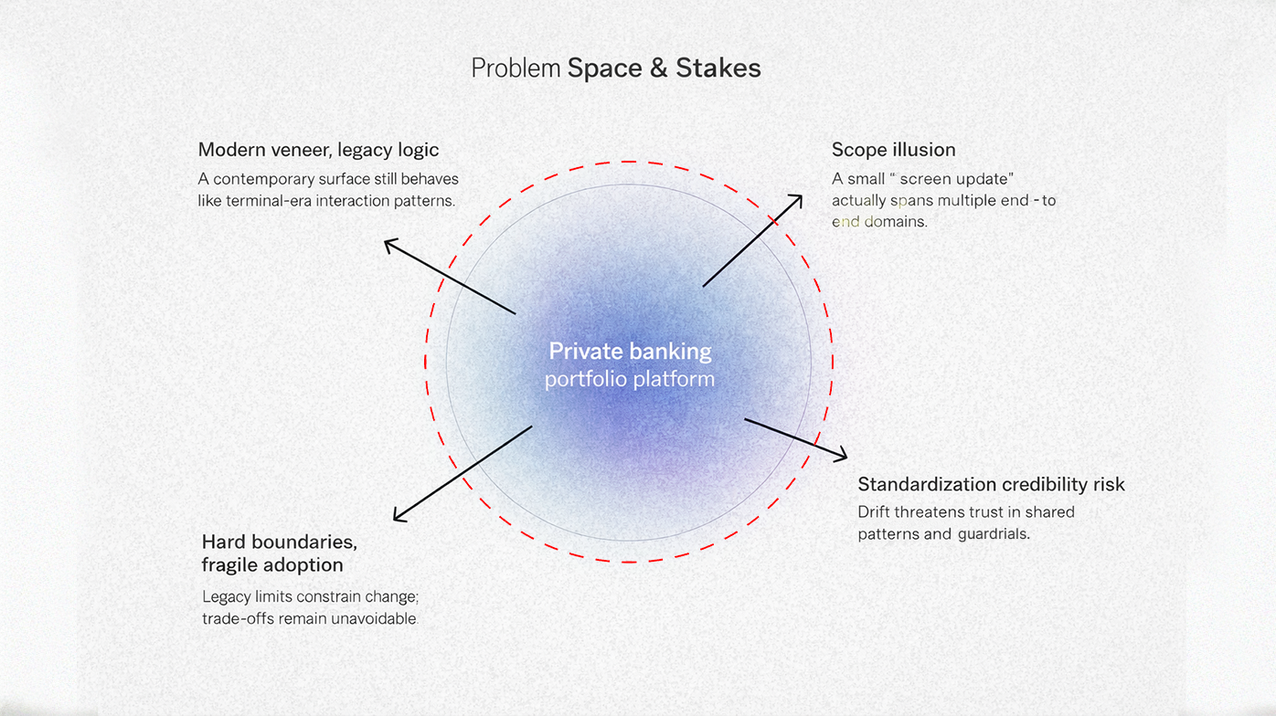
- “Modern UI / legacy UX” mismatch: The
UI was a visual translation of “black screen” legacy behavior; navigation and
inputs still felt like terminal logic.
- Scope misunderstanding: The initiative
was initially briefed as a “7-8 screen” update, but the real system spanned
four distinct workflow scopes (retrieve, manipulate, performance,
process/approvals).
- Strategic risk: If the rollout
failed, the organization would lose confidence in the design system and revert
to ad-hoc UI patterns.
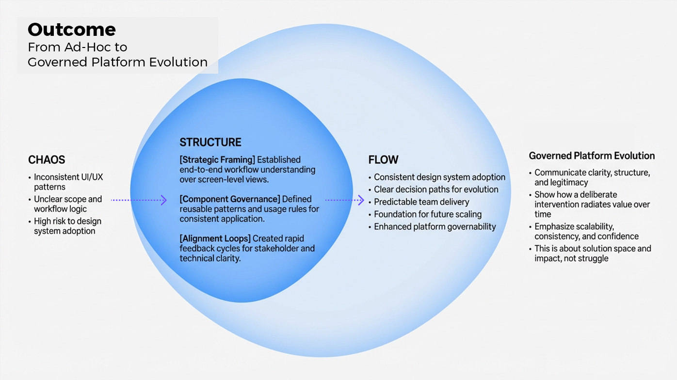
Workflow (before → after)
Moving from screen-by-screen terminal patterns to task-based
flows with reusable components.
Users navigated via
sequential screens and key-input patterns; context was lost when moving between
steps.
IA redesigned around tasks
+ a “3-click” rule so key actions stayed shallow and discoverable.
Performance monitoring
required exports (Excel) and manual stitching of information.
Integrated performance
views + pragmatic chart patterns that kept data binding stable.
Components were
implemented inconsistently across squads; UI drift increased over time.
A defined component set
(specs + usage rules) and a governance approach to prevent UI drift.
Approach & Decisions
I reframed scope early, made the UX legible to
stakeholders, and built a component strategy the dev team could actually ship.
What I did (key moves)
- Discovery & problem framing:
Interviewed RMs, SMEs, PO/BA, and tech leads to map jobs-to-be-done and define
what “PMS v2” actually needed to solve.
- Re-scoped to workflows: Turned the “7
screens” brief into clear end-to-end workflow scopes (retrieve, manage,
performance, approvals).
- Defined navigation + IA: Built a
predictable structure (task groups, consistent entry points, shallow
navigation) to reduce cognitive load.
- Component strategy for delivery:
Translated the design system into shippable AngularJS patterns (states,
variants, usage rules) and reduced UI drift.
- Decision velocity: Used lightweight
prototypes + animated walkthroughs to compress feedback cycles and unblock
stakeholders.
- Standardization & guardrails:
Defined reusable components, usage rules, and decision boundaries so teams
shipped consistently without re-litigating patterns.
Decisions / trade-offs
- Functional-first charts: When chart
library constraints blocked “perfect” interaction design, I traded advanced
interactions for stable, readable patterns that shipped reliably.
- Subset the inherited design system:
Adopted the partner design system, but curated it into a smaller, consistent
set that fit our private banking use cases.
- Clarity over completeness: Prioritized
flows that mattered most to daily RM work, then expanded coverage once the
baseline was stable.
Delivery under Constraints
Legacy backend boundaries, a newly adopted design system,
and a front-end team ramping up on AngularJS constrained how fast we could move.
Constraints (top 3)
- Legacy boundaries: Core backend
behavior could not be rewritten; improvements had to be achieved via UX design
+ selective API exposure.
- Design system adoption: The design
system was new and “not yet ours” and required curation and clear usage rules
to avoid fragmentation.
- Execution risk: The dev team needed
guidance on implementing design-system patterns correctly in AngularJS (to
prevent mismatched UI/UX).
How I reduced risk
- Implementation-ready specs: Component
definitions included states, edge cases, and “do/don’t” rules so dev work was
less interpretive.
- Fast alignment loops: Compressed
decision time by packaging options into bite-sized walkthroughs for
stakeholders and PO.
- Cross-team translation: Bridged user
needs ↔ PO intent ↔ technical feasibility so trade-offs were made once (not
re-litigated every sprint).
- Platform governance: Established
ownership, review flows, and escalation paths for design-system decisions to
prevent drift.
Impact
Successfully transformed a fragmented legacy update into a
scalable platform baseline, establishing the design system as a
high-velocity delivery engine for the bank.
Delivery Velocity
30-40% efficiency gain in
design-to-dev throughput by standardizing reusable components and reducing
rework loops.
Strategic Re-scoping
Prevented project stall by reframing a
"7-screen" brief into 4 mission-critical workflows,
aligning tech specs with actual RM behaviors.
Platform Governance
Established repeatable guardrails
and usage rules that eliminated UI drift across multiple engineering
squads.
What improved
- Design throughput: Estimated
30-40% boost in design efficiency once component patterns were
reusable across screens.
- Iteration quality: Reported
6-8% stepwise improvement per iteration as UX rules and
components reduced rework.
- Scale readiness: A component baseline
and governance approach that reduced UI drift across squads.
- Estimation basis: Repeated reuse of
component specs across screens + fewer rework loops during implementation.
- Governed adoption: Shared standards +
decision rules enabled consistent rollout across teams without central
bottlenecks.
Next improvements (post-launch roadmap)
- Strengthen governance: Formalize
ownership (review flow, versioning, and change logs) so the design system stays
coherent as more products adopt it.
- Design-to-dev pipeline: Add a tighter
handoff path (component inventory, implementation status, and documentation that
stays current).
- Expand coverage: Extend patterns to
additional workflows (approval chains, edge cases, and power-user shortcuts)
once baseline is stable.
Learnings
A design system is not an asset you “install” — it’s a
product you operate.
Operating lessons
- Re-scope early, or pay forever: “7
screens” became multiple workflow scopes; surfacing this early prevented
late-stage surprises.
- Adoption beats elegance: The best
patterns are the ones the team can implement consistently (especially with skill
gaps and legacy constraints).
- Governance is the multiplier:
Components only scale when there’s ownership, rules, and a simple decision path
for changes.
- AI parallel: Platforms scale when
standards, controls, and adoption paths are explicit, exactly the challenge
Responsible AI programs face.